Yer a wizard wageworks! Bad UX indicates a broken value chain
It’s 2020 and harry potter is both on broadway and in the NY historical society for some wtf-styled reason, but to me, the best evil wizard of the year so far is the wageworks COBRA election form.
This isn’t a health insurance company, it’s a change management service for employ-ers / -ees. That means that wizards and billing are all they do. There are good reasons for them to suck this bad (which I’ll explain below), but it’s still an achievement worthy of recognition.
- Perfect game
- Desperate connection to paper
- Extra points for lack of certainty
- Value & power
- Left-hand right-hand
- The road to hell is paved with evil wizards
Perfect game
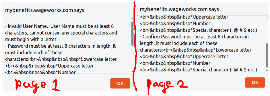
I wouldn’t be so giddy about this if they hadn’t knocked it out of the park at my very first interaction. Look at the alert box that popped up when I foolishly put a hyphen in my username and forgot to correctly punctuate my password:

The correctly escaped HTML is a good sign. Much more important is that I didn’t know before that alert boxes could scroll. I’ve never seen an alert box with a scrollbar before.
Also this box correctly identifies that both ‘Password’ and ‘Confirm Password’ are wrong.
It’s not like my 2020 hasn’t had its share of bad UX. I used a miswired app that randomly applied actions to the wrong list item (this is a top 10 app, there’s no excuse for it to work badly). I used a form that had placeholders but no labels so it was impossible to check after filling it out (from a huuuuge, giant software company). But wageworks is in another league.
I think I’m experiencing this as art because it’s not just a UX fail: it’s the mix of bad UX with other forms of user-hostility. Every page, for example, has a bunch of legal boilerplate that threatens to erase my health coverage if I mispronounce the latin.
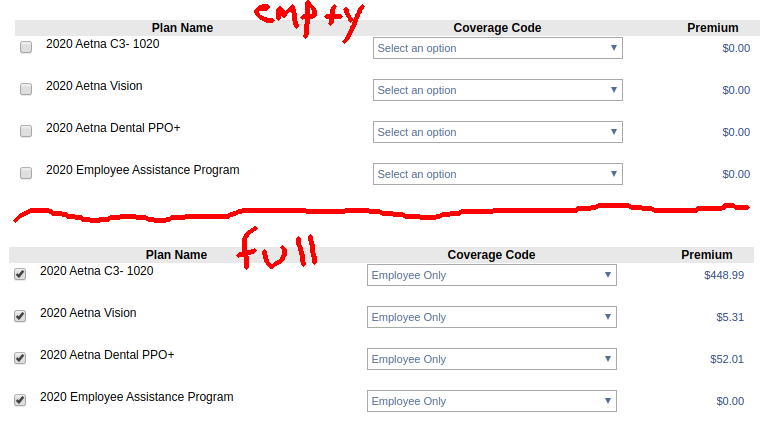
Wageworks also scores highly for lack of transparency. Take this enrollment checklist that doesn’t show prices until I populate a checkbox and a dropdown:

Slow page load, lack of loading indicators, and broken browser-back are familiar details that they also got right.
Desperate connection to paper
Their various references and disclaimers about things being lost in the mail only make me like this site more. It adds a nostalgia factor that earns them style points.
A term at the beginning of the wizard includes by reference a document that’s probably still in the mail:
Before continuing, please read the additional information included in the notice regarding your COBRA continuation coverage originally mailed to you
I.e. someone couldn’t figure out how to link to a PDF! WTF.
Another term at the end of the wizard requires me to certify that I’ve received the document and read it (I forgot to screenshot it so I don’t have the exact text). I haven’t received it yet. Am I a criminal now? Why would my ability to sign up for health coverage online depend on getting a doc in the mail?
Extra points for lack of certainty
Check out these cool features I scraped from the legalese that’s peppered across the different pages of the wizard:
Prices can increase at any time:
Note that these amounts will change in the future and will most likely be higher than they are now
The agreement is tolerant of their mistakes but not mine:
Our acceptance of premium payments is not an indication that coverage is in force
if you do not receive an invoice for any reason, you must still pay the required premium by the applicable due date
This is just wrong, I wasn’t prompted:
If you choose to elect COBRA online, you will have the opportunity to print your initial invoice immediately
The UX philosophy here is ‘this is confusing but one mistake (on your side or ours) and you’re dead to us’. Billing and change management is their entire job. Refusing to play ball on this stuff is a tasty blend of malice and incompetence which further extends their lead in my bad UX ranking.
Despite the numerous assurances that wageworks may change or remove my insurance at any time for any reason, at no point does this process include any guarantee that I’ll get or keep health insurance. I’ve yet to receive a receipt.
Value & power

Their friendly motto is ‘everyone benefits’ (it has what looks like an asterisk next to it, so T&C may apply). It reminds me of this shutdown post from today which quotes a marketing textbook saying:
To succeed, an offering must create value for all entities involved in the exchange – target customers, the company, and its collaborators.
The reason this can be so crappy for me is that I’m not really a stakeholder. My ex-employer isn’t really even a stakeholder. Justworks, the PEO that contracts to wageworks to provide COBRA, may be one.
How am I not a stakeholder, you ask? I have neither of the two levers that consumers use to get better service from companies: exit and voice. I’ve already exited, in that I’ve been fired or quit my company by the time I’m getting cobra. And I’m not making a new purchase decision, and can’t take my COBRA business elsewhere, so I don’t have a voice.
The fact that you can only sign up for health insurance at randomly chosen dates per year is icing on the cake and further reduces my power here. The system is strangely design to empower opaque bureaucracy. This is the sharp end of a very, long, stick.
I listened to an interview with the director of an oklahoma surgery center who claimed that adding price transparency to medicine allows his clinic to perform surgeries more cheaply and provide more value to his users i.e. patients. I get that this is a fraught issue and people differ in their willingness to allow market forces into health care, but market forces are generally good at setting sane prices . Egregious cases like martin shkreli’s aids drugs or this nitrofurantoin guy are, in my opinion, enabled by an insurance dominated market where doctors and patients don’t know how much things cost. Nobody’s saying not to have insurance for people who need it and for catastrophes.
I think the ability to easily pay for routine health issues out of pocket enables price setting mechanisms but also restores quality and dignity to healthcare. Here’s $100, you now owe me X.
This site wins my bad UX award because its bad usability transcends UX and goes to value. It’s not just hard to navigate: it uses bullying and uncertainty to create existential dread about a life or death service. It’s a distraction hiding inside another distraction – health insurance itself is confusing, complex and variably applicable. By adding a layer of pain on top of that, it directs my attention to the beautiful assistant (or in this case beautifuly ugly UX), like a malicious stage magician or (wait for it) some sort of evil wizard.
Left-hand right-hand
Here’s who else takes your money and treats you bad: the DMV.
I paid a traffic ticket a few years ago. There’s a statutory limit for what you can be charged for speeding in new york state, but the DMV gets around it by charging an additional ‘driver responsibility assessment’ to keep your license. The DMV’s best trick is that they juggle responsibility for the whole procedure with the county court that charged me – ‘we can’t do anything about that, just pay us’ was a conversation I had a few times. When I paid them, they didn’t issue any kind of receipt – I assume my license is valid but I could be wrong.
This left-hand right-hand stuff is genius and wageworks is taking a page out of this book with their relationship with aetna, my actual insurer. It’s not clear to me what value wageworks adds to this situation. (Given that I’ve never gone over my insurance deductible ever, it’s not entirely clear to me what aetna adds).
The ability for agents to disclaim responsibilty is a major problem for consumers dealing with big institutions. Every institution has learned to have separate carrot and stick departments. I haven’t read any foucault, but in a sense every user of the institutional internet is reading foucault whenever they sign up for anything, or god forbid try to complain.
Lack of receipts or a clear indication that an exchange has taken place is another good trick that consumers need to get wise to. Collective bargaining by consumers to get better product value or desired features is something I haven’t seen before but I expect to see in the next year or two. I don’t mean class action suits, I mean ‘there’s a thousand of us, build X or remove cookie Y or we’re out’.
The road to hell is paved with evil wizards
Or not. But I’ll leave you with this Good Omens quote. (No, I haven’t seen the show).
Along with the standard computer warranty agreement which said that if the machine 1) didn’t work, 2) didn’t do what the expensive advertisements said, 3) electrocuted the immediate neighborhood, 4) and in fact failed entirely to be inside the expensive box when you opened it, this was expressly, absolutely, implicitly and in no event the fault or responsibility of the manufacturer, that the purchaser should consider himself lucky to be allowed to give his money to the manufacturer, and that any attempt to treat what had just been paid for as the purchaser’s own property would result in the attentions of serious men with menacing briefcases and very thin watches.